AI Knife Review
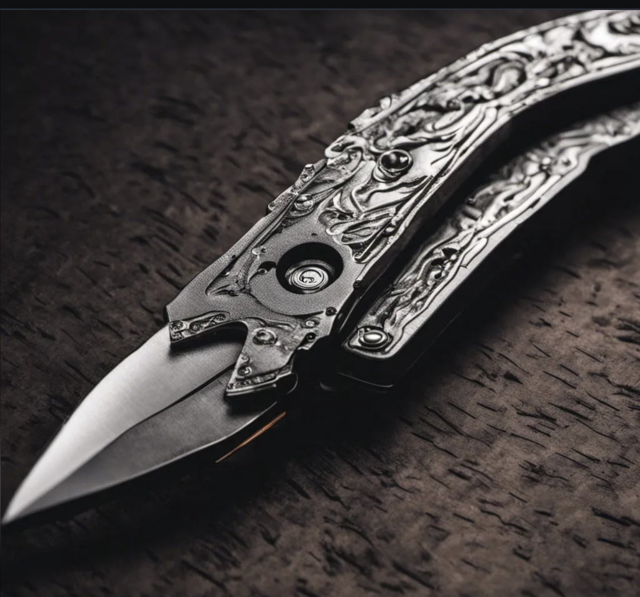
I love thinking about good design—especially good design of gear. I have dedicated millions of works to the topic as it is the single unifying thread of the writing I do here and on Gear Junkie (yep, I write for Gear Junkie, which is one of the best review sites on the web). So I thought it might be a good idea to see what someone else, or really something else things about good design. To that end I asked an AI image program (DALL-E 2) to work on the problem of good knife design. The image above was what the AI produced when the prompt was: “Create an image of the perfect folding knife.” My overall assessment: we don’t have to worry about SkyNet just yet.
Let’s look at the flaws in the AI knife. First, for a folding knife it doesn’t seem to have the ability to fold. Maybe that indent with a circle in the middle is a pivot but there is no visible blade well. Second, there is no way to open the knife. As a folder there needs to be some way to extend the blade out of the handle—a flipper, hole, or thumbstud. There is nothing of the sort.
Then there is the blade itself—its comically stubby, poorly ground, and has no obvious function. Other than weird designs that result from legal restrictions like the California auto, there is no reason a folder should have a stubby blade like this. If it is a folder it should use as much of the blade well as possible. Here there is no blade well but even without that, the handle is probably three times larger than the blade, so big swing and a miss for the AI. The grind, which is kind of a dagger grind, sorta, seems to get less distinct as the knife tapers to a point. It also seems to go off to one side. Dagger grinds suck, other than on a true dagger, because of their extremely limited utility and wedge-like terminal edge, but they REALLY suck when they are asymmetric and less than crisp. As a degree of difficulty show off move for an expert grinder, dagger grinds are okay, but this knife was clearly not the product of any expertise.
Then there is the handle. Which kinda looks like someone wadded up aluminum foil or, perhaps more apropos for the topic, like T1000 caught mid-morph. The shape is also terrible with no concession to the fact that it is a tool for a human hand. The two level terrace design seems silly. Now as a texture the mid-morph T1000 looks like it might work, though pulling this in and out of a pocket would probably destroy your pants pretty fast.
Overall, if I were running this knife through the scoring system, I would almost certainly give it a 0. Obviously, we don’t know the steel. I can’t say for sure because because I can’t handle it and thus don’t know how shreddy the awful terraced handle is, but in Design, Fit and Finish, Carry (oh, no clip), Grip, Blade Shape, Blade Grind, Deployment, Retention, and Lock (oh yeah, no lock either) it very likely gets a 0, just from the image. That means, at VERY best, the knife is working with 2 points. Hopefully our AI Overlords would chose Magnacut to give there design a fighting chance. AI Folder with Magnacut gets a 2.
So, um, yeah…we don’t have to worry about AI design in the knife world.

